Landing Page Revamp, Visual Attraction is Only Half of the Battle

13 Mei 2017

Our product, Handl, had just finished our first trial. You can read more about it on this article, "Starting a Business and The Product".

We wondered about what the next step would be and we decided to try on launching the product for public. For that, we would need to develop a landing page for our product.

Landing page 1.0

We were pretty confident with the website, it looked very cool and it had good story-telling.

But…

After gathering some user feedback, it really hit us that we missed out on what our product actually offers. Only then we just realized that the story-telling only focused on what the problems are. We were to focus on the visual and the context isn't fully there.

. . .

Taking a step back…

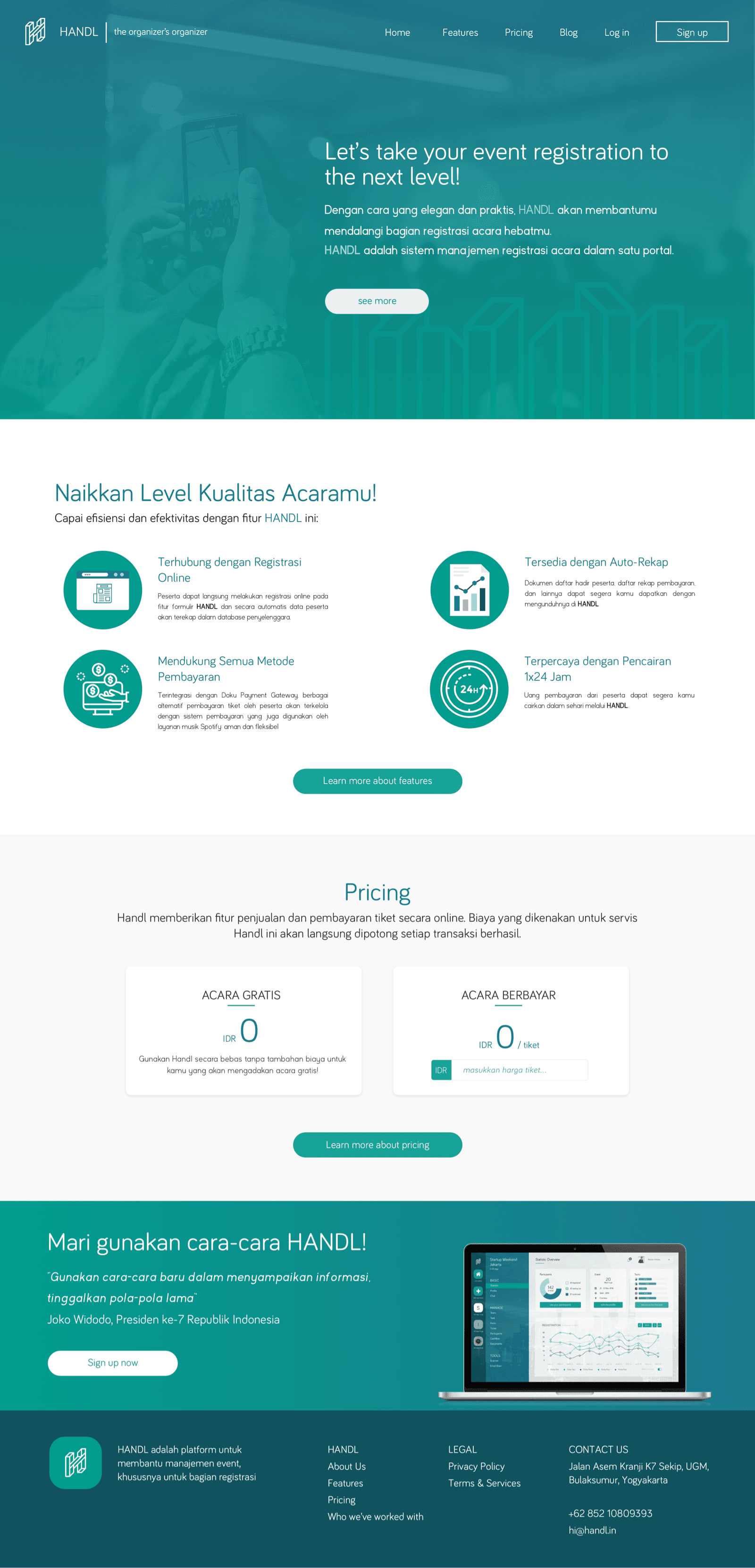
From the feedback, we then tried to re-structure the content. The missing critical content were about the features and the pricing. The website doesn't even have any contact information. Without these, it's hard for people who visited the website to trust the service or the product.

So we redid the design and here's…

Landing Page 2.0
. . .

With the new landing page, we got lesser bounce rate, and we got more engagement from the visitors. There were still lots of area to improve, but at least we definitely head to better direction.

Thank you for reading. Have a lovely day :)
Thank you for reading.
Have a lovely day :)