Establishing Design Principles for Constraints

30 Sep 2023

Getting mixed-up feedback

There is a very complex feature for stock management in one of our products.

It has so many combination of use cases from various type of users and their scenarios. At the time, it's pretty difficult as well to distinguish the priority because we're keep getting mixed feedback. Needs from some user can be other's preferences and vice versa.

Because of that, the team seems couldn't get into the same page, we were basically stuck, and it was very hard to keep moving forward.

Considering different approach

The problems were pretty much understood and well-defined. It was just the solution that can't be decided because everyone had great ideas, everything had their pros & cons. In order to make progress. I tried to establish the core principles of the features first. Why?

  • I thought it would help explain the process and decision much faster later. If they didn't agree on the principles, why even bother discussing on the solution.

  • Also, for the long-term, I thought that these would help to keep scaling the features.

. . .

The Principles

  1. No Horizontal Scrolls

    By having only one dimension of scrolling, it makes the monitoring much easier because the reading pattern is also easier.


  2. Less Text, More Visual

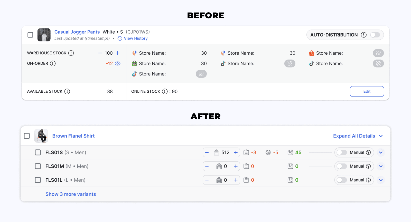
    On the first iteration, I decided that showing full information would be mandatory because the features are very complex, and I think it works quite good to some extend. But the trade-off is very apparent, all of that information is taking lots of space in our stock page.

    So in this iteration, I tried different approach to optimize more space, but we should spend extra effort to leave out more hints on every possible user interaction, for example showing tooltips on hover interaction.


  3. Contextual Interfaces

    The abundance of use cases in the stock page can make us confused on which cases to prioritize.

    In this iteration, I decided that the first layer of the page is for monitoring. For other cases, for example updating stocks, the UI can be hidden in a more "contextual" manner to make the page much more compact.

    This would also mean that we can start considering more on personalization within the page, for example let users

    decided if they wanted to see certain information or not.

. . .

One of the application

Thank you for reading. Have a lovely day :)
Thank you for reading.
Have a lovely day :)